Images are a vital part of every blog as they allow us to showcase our projects, the products we sell and any services we may offer. They are used to not only grab a reader’s attention, but can really help with the look and feel of the website.
You will no doubt be taking lots of photographs for your website. There will be photos of your projects, maybe some step-by-step tutorials too; you’ll have branding images and promotional images from Stampin’ Up!
In general, a crafty blog is really image heavy, so it’s really important to know how to use images on your blog.
Not understanding how to manipulate the images can lead to slow page speed, poor SEO (search engine optimisation) and blurry, poor quality images.
So let me share some top tips on how to select your image size.
Why is image size important?
Every time someone visits your site, the browser has to load the images on that page. The larger the image, the bigger the file size and the slower it is to load. If you have poor speed on your site, visitors are more likely to click away from your site to find a site that is more responsive. So the size of your image can really affect a visitor’s experience and the overall success of your blog.
We measure size in 3 elements:
- File size – the number of bytes the image takes up on your computer. This is what affects the speed of your website.
- Image Size : this is the dimensions of your image, measured in pixels. The height and width are given in pixels and determine the ratio of the picture.
- Resolution : this measures the quality of the image, and is calculated in dots per inch (dpi). Most web displays required 72 or 92 dpi, whereas for printed pictures you would be looking at 300dpi. Therefore using higher resolution images on the website is unnecessary and adds additional unrequited weight to the page.
With these 3 elements in mind, we want to aim for an image file size as small as possible, and ideally under 200kb. However, you don’t want to it to be so small that the quality of the picture is not good either. So what is the best size?
What is the best image size for my blog?
This is the question I get asked all the time and sadly there is no one size fits all, but there are some really useful rules you can learn to help you.
In reality, the perfect size of your image depends on where you want them on your website.
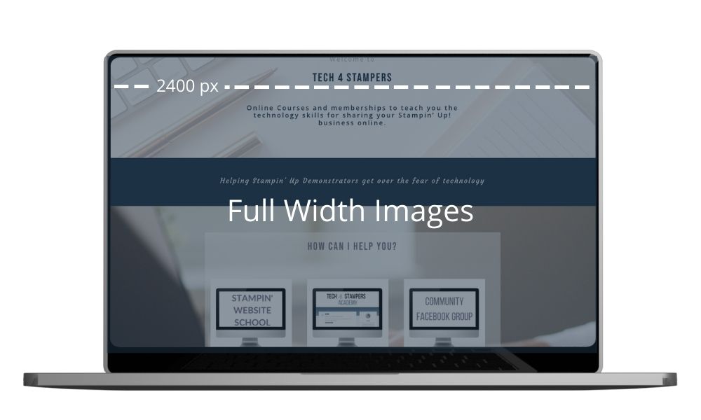
Full Width Images
Across the site you might have sections where you need to use full width images that cover your whole screen from left to right like a full screen slideshow or a banner image.

To ensure that your full width images look good across any device big or small the recommended size is 2400px wide. The height will depend on how deep your section is, to fill the page you need it to be 1600px high.
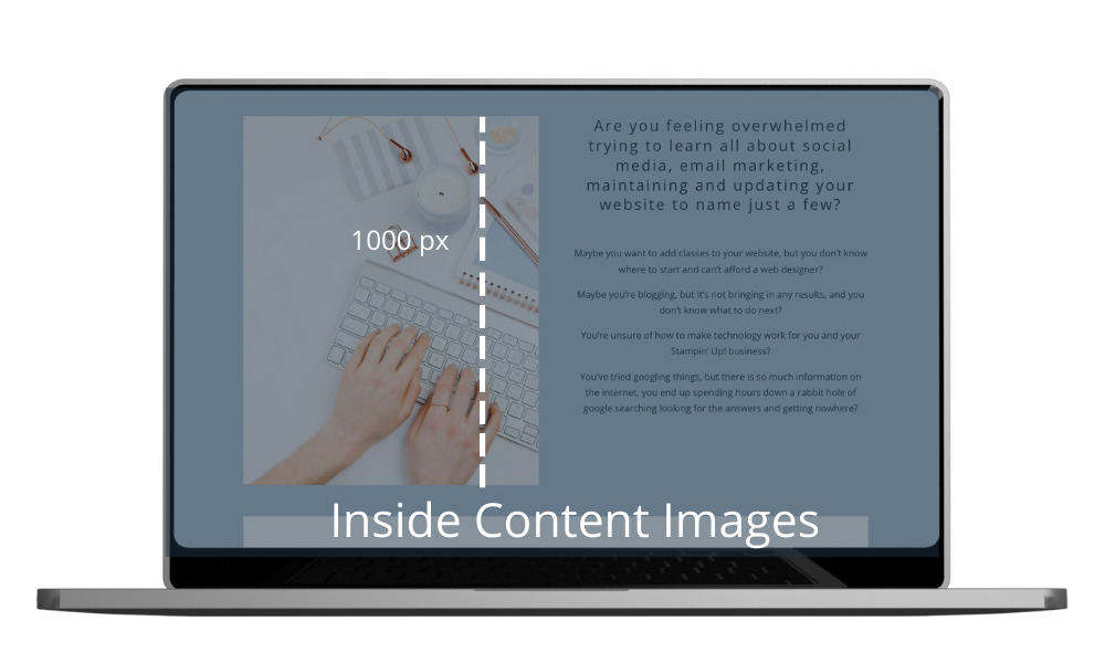
Inside Content Images
For images on your pages that fit into a column then you need to make these a smaller as uploading a 2400px wide image is just adding unnecessary weight to the page. So for any image where you have some other content taking up the width of the site I would aim for either 1000px tall for portrait images or 1000px wide for horizontal images.

Logo image
Logo’s need to be kept as small as possible too. So it’s best to create a web version of your logo that is no more than 320px wide or 100pixels high. When creating smaller versions of images, don’t forget to keep your original one, as the large size may be needed for other uses like printing flyers etc.
So now you know about pixels, what about the actual file?
Why is the format of the image file important?
You will often be working with either JPG or PNG files. So when should you use which one and why does it matter?
Most images on a website should be a JPG. This is because they are smaller in size than a PNG so will help with the loading of your blog pages. PNG’s allow for a transparent background and are a higher quality (that’s why they are bigger in size), so these can be used for logo’s and illustrations where you need that quality and transparency. If you are consistently loading PNG’s – the suggested file format from programs like Canva – you will be loading larger files than you need to.
And finally …
Even though this can seem confusing at first, the more images you edit and load onto your website according to these guidelines, the easier it becomes. (Why not bookmark this page so you can refer back to it!)
Editing photo’s before uploading them to your blog, will help your reader’s experience and ultimately benefit the blog.
If you want more tips and tricks like this, why not come and join my Free Facebook Group.


Louise,
You sure do teach us well!
Thank you so much Kristie